The Quiet Design Detail of New York Dining Rooms: Menu Covers
New York restaurants spend a lot of energy on the moment before a dish arrives. The lighting, the music, the chair, the napkin, and the tabletop all set a tone. A menu is one piece of that first impression, and the cover it arrives in can matter as much as the paper inside. In a city of small dining rooms and fast turns, the choice of menu covers for restaurants often reflects the same care given to the room itself.
A menu cover is rarely the star, and that is the point. It is a simple object with a quiet job: to feel right in the hand, to frame the menu, and to hold up to hundreds of touches a week. The best covers disappear into the room. A careless one announces itself through a sticky edge or a cracked spine.
One of the First Objects a Guest Handles
By the time a server sets down a menu, a diner has already felt the weight of the front door, the texture of the chair, and the cool rim of a water glass. The cover is another quiet signal in that sequence. A thick leather cover with rounded corners feels settled. A thin, warped folder feels like an afterthought. The difference can register before a guest reads the menu.
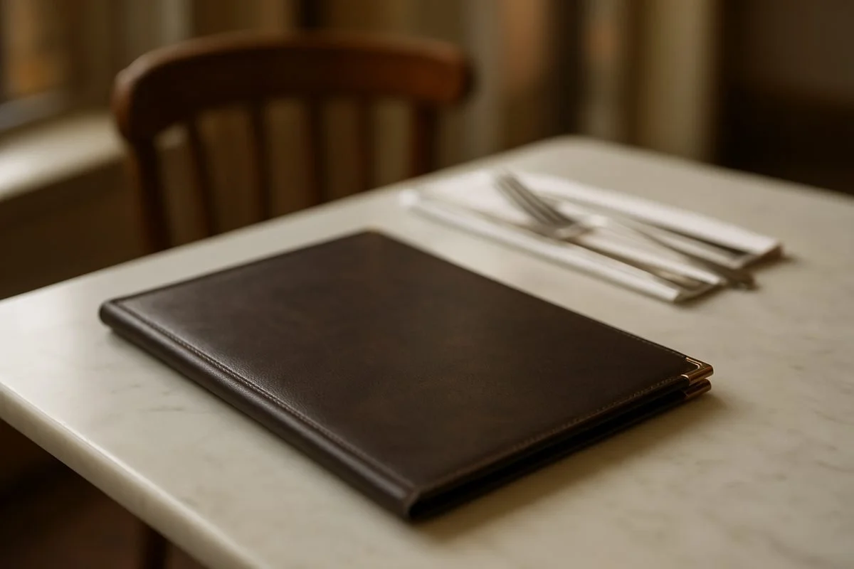
The style begins the story of the room. Dark leather with brass corners suits a clubby steakhouse-style room. Light wood or cork fits a plant-filled cafe. Soft green or burgundy leather belongs in a wine bar, while a minimal black cover reads as right for a tasting counter. These pairings are rarely accidental.
How a Cover Matches a Room
Cover colors can echo an existing room palette. Warm brown or cognac leather echoes a wood floor. Navy or deep green picks up painted wainscot. Black aligns with blackened steel or matte black table legs.
Edge details matter in close quarters. Brass or nickel corners add a traditional note and protect the corners that get knocked against table edges. A blind debossed logo gives a quiet sense of identity. A stitched border in contrasting thread can feel more casual. In a city where tables are inches apart, these small choices read clearly.
Materials and the Way They Age
Leather is one common option, but it is far from the only one. Full-grain and top-grain leather take handling well. Over months a cover develops a patina along the spine and near the edges where thumbs rest. Pull-up leather shows lighter streaks when flexed, because the oils and waxes shift under the surface. The marks often look temporary, and they may fade partially as the material settles, but not every pull-up leather returns to a uniform color. Crazy horse is one finish in that family, not another name for all pull-up leather.
Recycled bonded leather costs less and has a uniform surface, though it does not develop the same depth. Cork is light and warm, and with a protective finish it can be easier to wipe clean. Birch plywood and walnut veneer have a Scandinavian feel and work well in cafes and all-day spots. They hold their shape nicely. Whether they wipe clean easily depends on the finish, so the staff follow the maker's care guidance rather than treating every cover the same.
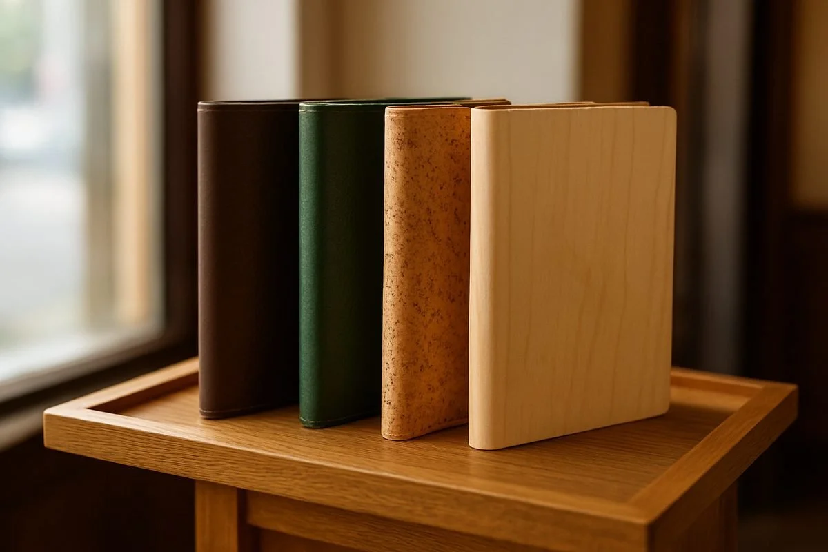
Different materials give the same simple object a very different tone in a dining room
Quality shows in stitching and hardware. A tight, straight stitch suggests care. Screw posts, ring mechanisms, and laces affect how easily a page is changed. Brass corners are functional as well as decorative. A debossed logo can be elegant, but it should not compete with the menu itself.
The Formats Behind the Front Door
The shape of a menu changes what the cover needs to do. A classic book with clear interior sleeves suits a large, stable menu with several pages, because a server can slide fresh pages in and out. A single-sheet cover with an elastic band works for a menu printed fresh every day. The band holds the sheet or a folded sheet in place, and swapping the page is a matter of seconds. Cleaning still depends on the cover material and finish, so a leather cover needs different care from cork or sealed wood.
Long wine lists often call for a ring binder, which lets a restaurant add and remove pages as bottles sell out. Some lists are bound with screw posts, which keep the pages firmly in order. A narrow cover with a leather lace can hold a short reserve list. Restaurants might use paper sizes such as eight and a half by eleven inches or five and a half by eight and a half inches. A drinks or dessert card sometimes works well in a slim format around four and a quarter by eleven inches.
The closure should match the rhythm of service. Ease of opening is a practical consideration. A heavier clasp may look beautiful but can be slower to release during a busy turn, while a magnetic or strap closure is often quicker, though the specifics depend on the design. Elastic bands wear out and can be replaced. The best format lets a menu be changed, cleaned, and handed over without a second thought.
The Side Diners Never See
Diners encounter the cover briefly, while the staff handle and maintain it throughout service. Between seatings, covers are wiped, stacked, and returned to the host stand or a drawer. In a busy room, a single cover may pass through many hands in one night. The material choice is about how the object survives service, not only style.
Seasonal changes keep the front of house busy. When a menu changes, pages must be swapped quickly. A good cover system lets a manager change a page in a few seconds, not a few minutes. If a cover requires a special tool or a complicated unlacing, those updates become a small burden that repeats all year.
Storage matters too. Covers stacked flat can warp if they are not dry. Covers stored upright can rub at the edges. Some restaurants keep a few extras on hand, because a torn corner or a wine stain is not a reason to stop service. A good cover is built to be used and replaced when its life is over.
When a Cover Starts to Slip
A worn cover is not always a problem. A little patina on leather is usually a sign of a room that has been open long enough to earn it. But a sticky plastic sleeve, a peeling edge, or a spine held together with tape sends a quiet message that the house stopped noticing details. Diners may not name it, but the feeling lands before the first course.
A Small Detail That Holds the Room Together
Next time you sit down in a New York dining room, notice the cover without turning the evening into an inspection. The material, the format, and the condition all work together. A leather cover with softened corners feels different from a slim cork cover with an elastic band. A clean spine and a quick closure let the menu do its job and then get out of the way. A warped or sticky cover intrudes on the moment before the food arrives.
A menu cover cannot tell you whether the fish is fresh or how skilled the kitchen is. But it can add to the impression a room leaves, and in a city of small tables and fast turns, that small object earns its place in the first few minutes of an evening.