"All Kinds of Different": When a Brewery Stops Calling Itself Craft
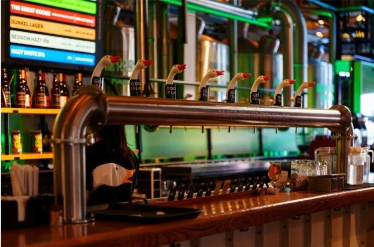
Photo by Declan Sun on Unsplash
Sydney Brewery used to name its beers after Sydney suburbs. It seemed a charming idea at the start, and then it started to feel like a fence. In 2021 the independent brewer redrew its brand, and the thinking behind it is worth a read for anyone launching something with a story to tell.
The reasoning
When Brews News covered the rebrand, it explained that the Surry Hills and Hunter Valley brewery, established in 2012, wanted designs that supported wider reach and expansion. It adopted the descriptor "All Kinds of Different" to reflect its mix of beers, ciders and seasonal brews, moved away from naming products after suburbs, and chose to be known as an independent brewery in place of a craft one.
The marketing manager said the company wanted to step away from the "craft" tag. The creative director at the branding agency, Boldinc, said the aim was to build a brand that "captured the eclectic bunch of characters behind the brewery".
It's a telling choice. "Craft" had become a crowded word, used by tiny operators and giant breweries alike. Saying "independent" instead drew a line around who owns the place and who makes the decisions.
Where a logo fits in
A beer label has plenty of moving parts: illustration, typography, colour, copy. But underneath sits the logo, the one piece that has to work on a tap handle, a coaster, a website and a stubby holder. If the mark is weak, everything else has to work harder.
That's why a founder building a brand from scratch could start with qpano.io custom logo design before anything goes near a label printer. The studio produces between one and four concepts, depending on the package, and revisions to match, and it's a logo service rather than a packaging one, so think of it as the foundation piece of the identity rather than the whole thing. The finished marks arrive in vector formats for the printer and PNG for the website, which is useful when the same emblem has to appear on a keg collar and a social avatar.
If you already know the beer, the logo is the bit that makes people remember who made it. Everything else, from the can art to the seasonal variations, can change around it.
Personality first
That last point is the useful bit. A brand isn't a set of colours. It's a way of putting the people behind the product on the shelf.
Designers who work on beer packaging say the same thing. A trade report from 2015 on the Yenda Green Hop beer noted that craft label art had become bolder and quirkier, and quoted one graphic designer saying the biggest thing is trying to share the brewery's personality and the quality of the beer. It was written some time ago, but the instinct hasn't changed.
Think about the places a drinker meets you. A tap handle in a dim pub. A can in a fridge between thirty others. A coaster under a glass at the end of a long day. In every one of those, you've got a second or two. A clear, characterful mark does the talking.
Questions before you brief anyone
Who is this for, and who is it definitely not for? What three words should somebody use after seeing it? What's the oddest, most memorable thing about the people making the product?
For Sydney Brewery, the answer was a mix of characters and a range that refused to sit in one box. That became a line that's easy to remember: all kinds of different.
If you're stuck, ask the people who know you. Regulars and early customers often describe your product better than you do, and they use words you wouldn't think of.
A good test of any brewery logo is the tap handle in a dark pub, seen from three metres away over somebody's shoulder. If you can still tell whose beer it is, the mark is doing its job.
A word on naming
Dropping suburb names from its products gave the brewery room to release whatever it wanted. It's a quiet lesson for anyone naming a range. If your naming system limits what you can make, it'll eventually start to pinch.
Leave room for the thing you haven't thought of yet. A seasonal brew, a collaboration, a cider that turned out better than anyone expected.
Taking the long view
Shelves change, tastes move on, and an edgy label that looks fresh this year might look dated in five. The logo is the part that sticks, so make it simple enough to hold up when everything around it changes.
Keep a note of the decisions you make along the way, too. In two years you'll want to remember why the label is that colour.
If you're writing your own label copy, test it out loud. A line that sounds clumsy in conversation will read clumsily on a bottle or a tap handle, too.
If it can sit on a tap handle in a dim bar and still be recognisable, you've done most of the job.